
sRGB vs CMYK: Which Colour Profile to Use for Web and Print
Upload an image to a website and it suddenly looks faded and dull? Your colour profile is...
Read guideDrop an image and get its dominant colours as HEX, RGB and HSL, ready to paste into your CSS or design. Click any swatch to copy it. Great for matching a site to a hero photo. Nothing is uploaded.
JPG, PNG, WEBP, works best with photos and product shots
These are the six dominant colours the tool pulled from a mountain-lake photo. The actual output, copied straight from the tool, not a mockup.

The two teals at 25 percent each are the water and the shadowed pine; the warm brown is the rock; the pale blues are the sky and its reflection. The percentages tell you which colours to build around and which are just accents.
Drag any photo onto the box and the palette appears instantly, sorted by how much of the image each colour covers. Use the slider to pull anywhere from four to twelve colours.
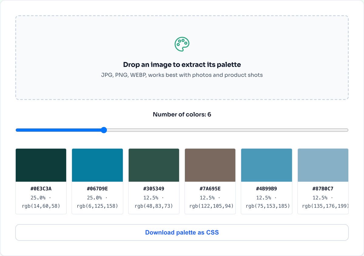
Click any swatch to copy its HEX to your clipboard, or use Download palette as CSS to get all of them as variables ready to paste into a stylesheet. Every swatch also carries its RGB and HSL values.
The tool does not grab a few random pixels. It scales the image down, reads thousands of pixels, and runs a median-cut algorithm: it repeatedly splits the cloud of colours along its widest axis until it has as many groups as you asked for, then returns the average colour of each group.
The result is sorted by coverage, so the colour at the top is genuinely the most present in the image, not just the brightest. That is why the percentages matter: they tell you which colours actually define the image and which are minor accents.
The most present colour is not always the most useful. A small vivid accent can define a design more than a large dull background. Use the percentages as a guide and trust your eye.
It gives you the raw colours. Turning them into a palette with tints, shades and accessible contrast pairs is still a design decision you make.
An image packed with many colours can average into dull greys and browns. It works best on photos and product shots with clear dominant tones.
It samples thousands of pixels from your image, groups them in colour space with a median-cut algorithm, and returns the largest groups sorted by how much of the image each one covers. Every colour comes with HEX, RGB and HSL so you can paste it straight into code or a design tool.
Click a swatch and its HEX is copied to your clipboard, with a checkmark to confirm. There is also a Download palette as CSS button that gives you all of them as ready-to-use variables.
Four to six is the practical maximum for a usable brand palette. Beyond that it gets hard to build a coherent design. The slider lets you choose from four up to twelve.
Colours covering under about five percent of the image are usually noise or small accents. Treat the top few by percentage as your real palette and the rest as optional highlights.
No. It reports the colours that are actually most present in the image, which is not always the most striking one. A tiny bright accent can matter more to a design than a large dull background, so use the percentages as a guide, not a rule.
No. The colours are read from the image directly in your browser through the Canvas API. Nothing is sent to a server, and it works offline once the page has loaded.
Adjust the colours and mood of a photo before pulling a palette.
Open toolCrop to the part of a photo whose colours you want.
Open toolResize a hero image once you have matched its colours.
Open toolConvert the image to a web format for your project.
Open toolShrink the image for the web once colours are set.
Open toolIsolate a subject before reading its colours.
Open toolBrand an image using a colour from its own palette.
Open toolInspect the other hidden data a photo carries.
Open toolUpload an image to a website and it suddenly looks faded and dull? Your colour profile is...
Read guideMost image SEO advice is a list of thirty tips with no order to it. This is the sequence that...
Read guideBuyers decide whether to click a listing in about two seconds, and they decide on the first...
Read guideA comprehensive comparison of JPG, PNG, and WEBP image formats. Learn when to use each format...
Read guide

